

by Ryan Thibodeaux, December 2019
Investment advisors and portfolio managers alike often struggle articulating why Fund A is better than Fund B. While everyone understands absolute returns (the upside) and most have an appreciation for risk (the downside), it's the interplay between the two opposing forces that can sometimes difficult to explain. Thankfully, the Sheldon Cooper's of the world have come up with all sorts of cerebral statistics that now have their names attached to them.
Sharpe Ratio: 
That's a fancy way of saying: if you earn more than one unit of "return" for each unit of "risk" you take - that's better than a sharp stick in the eye. However, from a long term investment perspective it is frustratingly illusive.
A Sharpe Ratio greater than 1.00 is considered good.
Sortino Ratio:  where
where 
Basically, Mr. Sortino thought Mr. Sharpe unfairly defined "risk" as the variability of a series of monthly returns, both positive and negative. So the Sortino Ratio only incorporates "downside risk" into the equation (i.e. "upside risk" = good).
A Sortino Ratio greater than 1.00 is also considered good.
Since all that arithmetic triggers freshman algebra nightmares, we prefer to illustrate with simple, powerful charts that tell the story themselves.
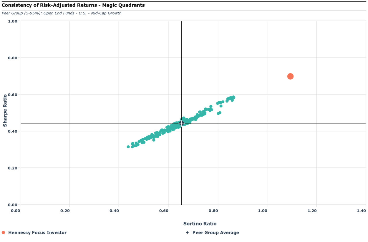
Think of the chart above like your freshman algebra girlfriend/boyfriend Pros vs Cons doodles - Bad/Bad = Bottom Left Quadrant; Good/Good = Top Right Quadrant
In this example, we plotted all Mid-Cap Growth mutual funds by their Sharpe and Sortino Ratios (remember higher is better). The result is a tight pattern of Funds (green dots) around the average (cross-hairs) , with a linear distribution of Funds that are better (top right quadrant) and worse (bottom left quadrant) than the mean.
In this example - The Chart is Worth a Thousand Words! (equations?)
Which quadrant does your Fund fall into?? To receive a complimentary analysis of a Fund you manage or a Fund you own, start here:

